Few logos in the world are as immediately recognizable as the McDonald’s golden arches. The design has become so deeply embedded in global visual culture that it is consistently cited alongside Nike, Apple, and Coca-Cola as one of the most recognizable marks ever created. This level of recognition reflects many of the principles seen in logos that successfully drive brand recognition and customer recall. But the McDonald’s logo did not arrive fully formed. It evolved over seven decades through a series of decisions that reflect both changing design sensibilities and the business strategy of a growing global brand.
This guide traces the complete history of the McDonald’s logo design, what the golden arches actually mean, and the design thinking behind the mark that exists today.
The Origins: Before the Golden Arches
The 1940s and 1950s
Richard and Maurice McDonald’s Original Branding
The McDonald’s story begins with Richard and Maurice McDonald, who opened their first restaurant in San Bernardino, California, in 1940. The original McDonald’s restaurants did not use the golden arches. Early signage was functional rather than designed for brand recognition, reflecting the standard practices of small independent restaurants of the era.
Stanley Meston’s Architecture and the Physical Arches
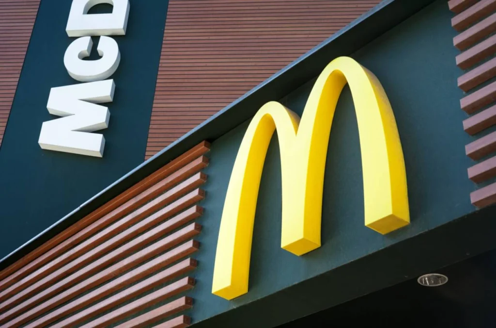
The golden arches as a physical architectural element were designed in 1952 by architect Stanley Meston. The original McDonald’s buildings featured two large golden arches on either side of the restaurant structure, visible from the road. These were practical signage elements designed to make the restaurant visible from a distance to passing drivers. The architectural arches predated the logo by several years.
The McDonald’s Logo Through the Decades
| Era | Key Design Element | Color Palette | Strategic Purpose |
| 1940s to 1950s | No unified logo; functional text signage | Varied | Basic identification |
| 1962 | First M formed from overlapping arches viewed from the side | Red and yellow | Creating a distinctive mark from existing architecture |
| 1968 | Jim Schindler’s unified M logo was introduced | Red and yellow | Consistent brand mark across all locations |
| 1975 to the 1980s | M refined with added ribbon/swoosh element | Red and yellow | Adding dynamism and modernity to the mark |
| 1990s | Font and proportion refinements | Red and yellow | Improved reproduction across new media |
| 2003 to present | Simplified, clean M; Im Lovin It campaign integration | Red, yellow, and green were added in some markets | Global consistency, emotional brand positioning |
How the Golden Arches Became the Logo
Jim Schindler’s 1968 Design
Turning Architecture into Identity
The transition from physical arches to a logo mark happened gradually. In 1962, the two separate arches were first combined into an M shape when viewed from the front, though this was more an architectural observation than a deliberate logo design. The true standardization of the McDonald’s logo came in 1968 when design director Jim Schindler unified the two arch elements into the single M letterform that forms the basis of the mark used today.
The Psychological Perspective
There is a widely cited story in design circles that Louis Cheskin, a psychologist and design consultant working with McDonald’s in the 1960s, advised against an early proposal to simplify or eliminate the arches on the grounds that they carried subconscious psychological significance. Whether or not this account is fully accurate, it reflects a genuine insight: the arches had accumulated recognition and meaning that made them worth retaining even when purely aesthetic considerations might have argued for something simpler.
What the McDonald’s Logo Means
The Meaning Behind the Design
The Letter M
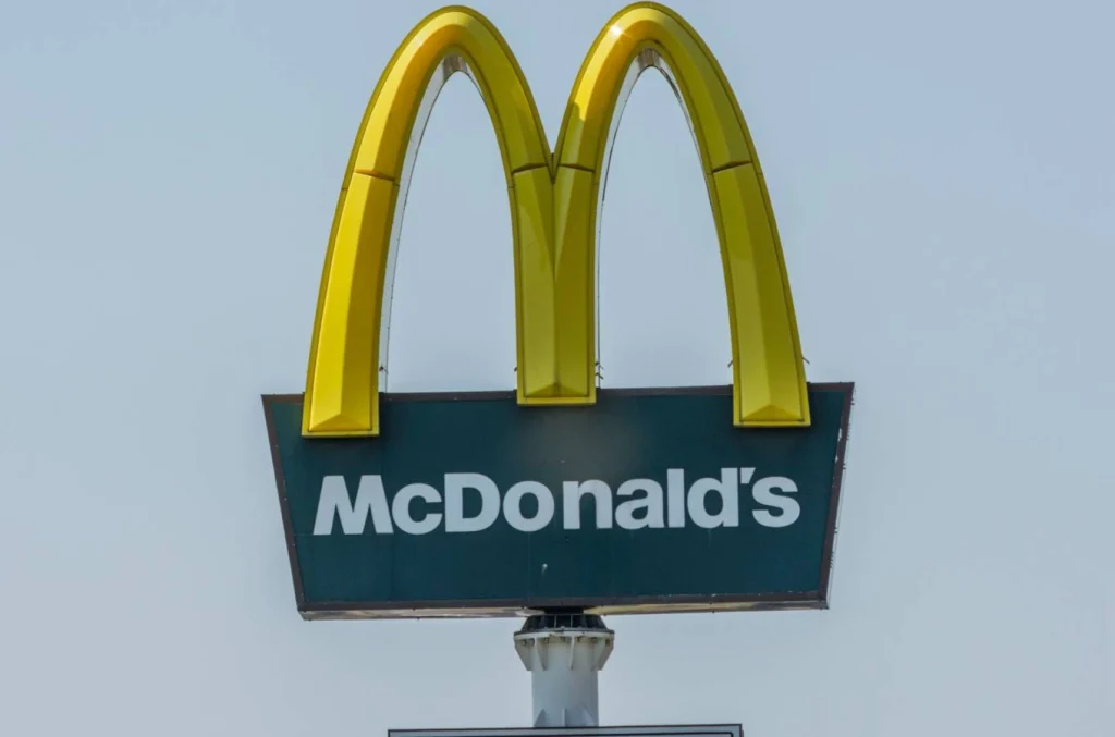
The most direct interpretation of the McDonald’s logo is simply the letter M for McDonald’s. This reading is both obvious and intentional. The M logo is a lettermark, a logo built from the brand name’s initial, which is one of the most enduring and scalable logo formats in brand identity. The McDonald’s logo demonstrates how well this format works when executed consistently over decades.
The Color Psychology of Red and Yellow
The McDonald’s color palette of red and yellow is one of the most studied combinations in the food industry marketing. Red is associated with urgency, appetite stimulation, and energy. Yellow is associated with warmth, friendliness, and optimism. Together, the combination is intended to create an environment that encourages quick decisions and positive emotional associations with the brand. Whether this color psychology works exactly as described is debated by researchers, but the palette has remained stable for over 60 years, which reflects McDonald’s confidence in its effectiveness.
The Golden Color Specifically
The specific golden yellow of the arches was chosen to stand out against the red background and to evoke warmth and approachability. Over time, the color itself has become inseparable from the brand. The specific shade of McDonald’s yellow is so strongly associated with the company that it functions as a brand identifier even without the M shape present in some marketing contexts.
The Modern McDonald’s Logo
2003 to Present
Simplification and the I’m Lovin’ It Era
The most significant recent change to the McDonald’s logo came with the 2003 brand repositioning that introduced the I’m Lovin’ It campaign and tagline. The visual identity was simplified and refined, with the M logo becoming cleaner and more consistent across all applications. This move toward simplification mirrors broader industry shifts highlighted in modern logo design trends that prioritize scalability and versatility across digital and physical platforms. The campaign also introduced a musical jingle that became one of the most recognized audio brand identifiers globally, extending the McDonald’s brand into sound in a way that supported and reinforced the visual identity.
Green Restaurants and Localized Adaptations
In European markets, McDonald’s has experimented with replacing the traditional red background of its signage with dark green to signal environmental commitment and a more premium positioning. The M itself has remained yellow. This adaptation shows how a strong enough core logo element, in this case the golden arches, can survive significant contextual changes without losing brand recognition.
Design Lessons from the McDonald’s Logo
What Other Brands Can Learn
Consistency Builds Recognition
The McDonald’s logo has been refined dozens of times over seven decades. It has never been fundamentally replaced. Many companies struggle with this balance, which is one reason so many logos fail to build long-term recognition and trust despite significant marketing investment. Every iteration preserved the core elements, the M shape, and the yellow color, while improving execution quality and consistency. This patient’s commitment to a consistent core identity is what allowed the arches to achieve the near-universal recognition they hold today.
Simplicity Survives Changing Contexts
The McDonald’s logo works at the size of a smartphone app icon, on a billboard visible from a highway, embossed on packaging, and as a standalone element in marketing materials. This scalability is a function of its simplicity. Complex logos with multiple elements, detailed illustration, or intricate typography do not survive scaling the way a clean, well-proportioned lettermark does.
Color Can Become a Brand Asset
McDonald’s yellow has become a brand asset in its own right. The brand owns that color within its category in a way that competitors cannot easily challenge. Claiming and consistently using a distinctive color over decades is one of the most effective long-term brand-building strategies available, and the McDonald’s logo illustrates the payoff of that consistency.
Final Thoughts
The McDonald’s logo design is a study in what happens when a simple, well-executed mark is deployed consistently across decades. The golden arches began as architectural elements on a single restaurant. Through deliberate design decisions, patient consistency, and intelligent adaptation, they became one of the most recognized symbols in the world.
The lessons are applicable at any scale: start with something simple enough to work in any context, commit to it consistently, and refine rather than replace when change is needed.
Express Logo Design creates brand marks built for longevity and recognition. If you are developing a logo and want design thinking grounded in what actually builds lasting brand equity, reach out to us.
FAQs
1. What does the McDonald’s logo represent?
The McDonald’s logo represents the letter M for McDonald’s, derived from the two golden arches that were originally architectural features of early restaurant buildings. The red and yellow color palette was chosen to evoke energy, warmth, and appetite-stimulating associations.
2. When was the McDonald’s logo created?
The physical golden arches were designed as architectural elements in 1952. The M lettermark was standardized in 1968 by Jim Schindler. The logo has been refined many times since, but the core M in yellow has remained consistent for over 55 years.
3. Why are McDonald’s arches golden yellow?
The golden yellow was chosen for high visibility and to evoke warmth and friendliness. Over decades of consistent use, the specific shade of McDonald’s yellow has become a brand identifier in its own right, recognizable even without the M shape in some contexts.
4. Has the McDonald’s logo ever changed significantly?
The core M shape and golden yellow color have remained consistent since 1968. Refinements have been made to proportions, font pairings, and reproduction quality. In some European markets, the background has changed from red to green, but the golden arches themselves have remained unchanged.
5. What makes the McDonald’s logo so effective?
Its simplicity, its color distinctiveness, and its decades of consistent use. A simple M shape in a distinctive color works at any size in any context, and seven decades of consistent application have built recognition that no amount of advertising alone could create.