A construction company’s logo needs to work in contexts that most other businesses do not face: on the side of a truck moving at highway speed, on a hard hat in direct sunlight, on a construction site hoarding board visible from a distance, and on a proposal document reviewed in a client’s quiet office. The design has to function across all of these simultaneously while communicating strength, reliability, and professional competence.
This guide covers the core principles of construction logo design, 15 ideas and approaches used effectively by building brands, and the specific considerations that separate construction logos that work from those that do not.
What Makes Construction Logo Design Distinctive
The Specific Requirements of the Category
The Applications Are More Demanding Than Most
Construction logos face an unusually wide range of reproduction contexts. Embroidery on workwear, vinyl wraps on vehicles, large-format site hoarding, high-visibility safety gear, and fine print on formal proposals all demand a design that remains clear, strong, and readable across every size and surface. This means construction logos need to be simpler, bolder, and more structurally sound than logos in many other categories, not less interesting, but more disciplined.
What Construction Logos Need to Communicate
- Structural strength and stability, often conveyed through heavy weight typography and geometric forms
- Reliability and precision, communicated through clean lines and balanced composition
- Scale and ambition, for larger contractors targeting commercial or civil projects
- Local identity, for smaller contractors whose competitive advantage is community presence and relationship
- Specialization, for companies whose competitive differentiation is a specific trade or project type
15 Construction Logo Design Ideas
Approaches That Work in This Category
1. Bold Geometric Wordmark
A wordmark in a heavy geometric sans-serif typeface is one of the most reliable approaches for construction companies. The weight and structure of a well-chosen heavy font communicates strength without needing a symbol. Fonts like Bebas Neue, Oswald Bold, or custom heavy geometric typefaces work well in this application. The wordmark scales cleanly from embroidery to hoarding and requires no separate symbol management.
2. Abstract Building Form
A simplified, abstract representation of a building or structure, reduced to clean geometric shapes, gives a construction logo a visual anchor that communicates the industry without literal illustration. A stylized roofline, a simplified building silhouette, or an abstract tower form works as a mark that is immediately industry-relevant while remaining clean enough for small-scale reproduction.
3. Construction Tool Icon
Hard hats, hammers, wrenches, cranes, and trowels are all immediately associated with construction. Used as a clean, simplified icon paired with a wordmark, a single tool silhouette creates a recognizable, industry-specific mark. The key is simplification: a realistic detailed tool illustration becomes muddy at small sizes, while a reduced, geometric interpretation retains clarity.
4. Initials or Monogram
For construction companies with long or complex names, a lettermark or monogram using the company’s initials is a practical and versatile choice. A well-designed two or three-letter mark in a strong typeface or custom letterform creates a distinctive identity that works across all applications where the full company name is impractical. Many of the most recognizable construction firms use monogram-style marks precisely for this reason.
5. Shield or Badge Format
Emblem-style logos with a shield or badge shape communicate the heritage, trustworthiness, and established credibility that construction clients, particularly residential clients selecting a contractor for a significant investment, are looking for. A shield emblem with the company name and possibly a founding year communicates longevity and stability.
6. Architectural Blueprint Element
Using a blueprint grid, a technical line drawing element, or a schematic-style visual reference draws a direct line between the construction company’s identity and the design and planning phase of building. This approach works particularly well for design-build firms and commercial contractors who want to signal technical precision alongside physical construction capability.
7. Crane Silhouette
The crane is one of the most universally recognized symbols of construction at scale. A simplified crane silhouette, whether as a stand-alone icon, part of a combination mark, or integrated into a wordmark, immediately communicates large-scale construction capability. This approach is most appropriate for civil, commercial, or industrial contractors rather than residential specialists.
8. House or Roofline Shape
For residential construction and homebuilding companies, a simplified house or roofline shape as part of the logo directly communicates the core product. This is one of the most straightforward residential construction logo approaches and works best when the house or roofline is reduced to its cleanest geometric essence rather than illustrated in realistic detail.
9. Strength Through Typography Alone
Some of the strongest construction logos use nothing but typography: a company name set in a bold, custom, or heavily modified typeface with strong character spacing and weight. This approach requires excellent typographic judgment but produces a logo that is infinitely scalable, easy to reproduce across any surface, and distinguished by the quality of the lettering rather than the addition of a symbol.
10. Color-Coded Specialization
Construction companies that specialize in specific trades can use color as a category signal: blue for plumbing, yellow and black for electrical, green for landscaping and sitework, red for fire protection. Pairing a strong wordmark with a color scheme associated with the trade creates an immediately comprehensible brand even for clients unfamiliar with the specific company.
Color and Typography in Construction Logo Design
What Works in the Category
| Design Element | What Works Well | What to Avoid |
| Color palette | Navy, steel blue, charcoal, dark red, orange, black; high contrast combinations | Pastels, light colors that disappear on white backgrounds or light surfaces |
| Typography weight | Bold to extra bold; heavy geometric or slab serif | Thin or light typefaces that fail in embroidery and small-scale applications |
| Symbol complexity | Simple, reduced silhouettes; geometric forms; 2 to 3 recognizable elements maximum | Detailed realistic illustrations that become muddy at small sizes |
| Overall shape | Horizontal or compact square; strong silhouette readable at a glance | Complex shapes with many irregular edges that lose definition at small sizes |
Five More Construction Logo Ideas
Additional Approaches Worth Considering
11. Brick or Block Pattern
A stacked brick or block pattern is an immediately recognizable construction material reference that works as a background texture, a symbol element, or an integrated design feature in a construction logo. The pattern communicates the craft of masonry and the structural permanence of built work.
12. Foundation or Grid Lines
Using horizontal lines suggesting a foundation or grade level creates a visual metaphor for the beginning of every construction project. Simple, clean, and architectural in character, this approach works well for general contractors and civil engineers who want to communicate methodical precision.
13. Triangle or Pyramid Form
The triangle is inherently structural, the most stable geometric form in engineering. A triangular composition or a triangle as a design element in a construction logo communicates structural integrity and stability at a visual level before the name is even read.
14. Negative Space Buildings
Using negative space within letterforms or geometric shapes to reveal building silhouettes is a sophisticated approach that rewards close viewing while maintaining a clean, simple visual impression at a distance. This approach demonstrates creative intelligence in the brand and tends to be remembered.
15. Combined Wordmark and Icon on Different Lines
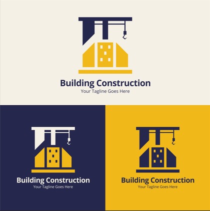
Stacking the company name above or below a tagline, with an icon sitting between them or beside them, creates a construction logo that works both as a complete combination mark and, with individual elements isolated, as separate marks for different applications. This is the most flexible structural approach for companies that will use their logo across many different contexts.
Final Thoughts
Strong construction logo design is defined by the same qualities that define good construction: it is built to last, it functions under pressure, and it does not rely on surface decoration to make up for structural weaknesses. The most effective construction logos are bold, clean, scalable, and immediately communicative of the company’s core positioning.
Express Logo Designs creates visual identities for construction companies and contractors across every trade and scale. If you want a construction logo built to perform across every context your brand appears in, reach out to us.
FAQs
1. What makes a good construction logo design?
A good construction logo is bold enough to read from a distance, clean enough to work at small scale in embroidery and print, immediately communicative of the company’s positioning, and structurally simple enough to reproduce consistently across vehicle wraps, workwear, proposals, and signage.
2. What colors work best for construction logos?
Navy, steel blue, charcoal, dark red, orange, and black are the most commonly effective choices. High-contrast combinations that remain legible on both light and dark backgrounds work best. Pastels and light colors that disappear against white backgrounds or in bright sunlight should be avoided.
3. Should a construction company use a symbol or just a wordmark?
Both approaches work. A strong wordmark in a heavy geometric typeface often performs better across construction applications than a complex symbol. When a symbol is used, it should be reduced to a simple, clean geometric form that remains clear at every size the logo will be reproduced.
4. What typography works best for construction logos?
Bold to extra bold weight fonts in geometric or slab serif styles work best. Heavy weight communicates strength and remains legible in embroidery, on dark backgrounds, and at small sizes. Thin or light typefaces tend to fail in the demanding reproduction contexts of the construction industry.
5. How many colors should a construction logo have?
Most effective construction logos use one to two colors. A single strong color plus black or white is the most practical approach for a logo that will be reproduced across vehicle wraps, embroidery, site hoarding, and formal proposals. Three colors are workable; more than three introduces production complexity that creates inconsistency.